The internationalization (i18n) library for Angular.
Simple example using ngx-translate:
stackblitz.com/github/ngx-translate/example
Setting up Visual Studio Code (Part 2)—HTML, CSS and JavaScript settings
My VS Code Extensions for web and angular development
These are the VS Code extensions I use currently for web and angular development:
Auto close tag
Auto complete tag
Auto rename tag
Beautify
Colorize
Debugger for Chrome
ESLint
Expand selection to scope
Highlight matching tag
Html Boilerplate
Html css support
Html snippets
Htmltagwrap
Intellisense for css class names
Jshint
Live sass compiler
Live server
Sass
Tag-rename
TSLint
Unibeautify
Visual Studio Keymap
Search and install trough VS Code Extensions tab or search here:
https://marketplace.visualstudio.com/VSCode
A javascript regex cheatsheet for all those regex haters (and lovers)
How to manage different environments with Angular CLI? [Updated for v6+]
Solved: Sourcetree GIT Client has stopped showing “new” files
There is a dropdown above the file list. If you switched it to “Modified” instead of “Pending”, it would only show tracked files that had changes.
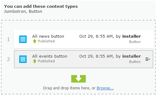
How to show Allowed types on Content Area – Grzegorz Wiecheć
Nice solution for EPiServer editors to be able to see which kind of content types that can be added to a content area in EPiServer. This solution is for older Episerver versions e.g. around 2015.
In EPiServer 11+ the js is minifed and inside a zip file at this location:
[EPiServer root folder]\modules\_protected\CMS\CMS.zip\11.4.6\ClientResources\epi-cms\contentediting\editors
I wont touch that for now but if someone does, please let us all know.
Read more here: How to show Allowed types on Content Area – Grzegorz Wiecheć
Visual Studio – What’s New in Visual Studio 2019
How to include and use jQuery in Angular CLI project
Tested in angular version 7:
- install jquery:
npm install jquery
install jquery typescript intellisense:
npm install @types/jquery - edit the angular.json file in root folder:
in the architect / build / scripts location, add this:"scripts": [ "./node_modules/jquery/dist/jquery.min.js" ]
- To use jquery inside a component.ts add this import at the top:
import $ from ‘jquery’;
Example code to check for functionality:
component html:<button (click)="testJQuery()">Test jquery</button>
component.ts:testJQuery() { $('html').fadeOut(); $('html').fadeIn(); }Click on the button should fade out and fade in the entire page.
Source: How to include and use jQuery in Angular CLI project
Open Source JavaScript Test Runner | Cypress.io
For end to end testing of websites, should be really simple to use and easier to setup than Selenium. Write javascript to execute tests.
Until now, end-to-end testing wasn’t easy. It was the part developers hated.
Not anymore. Cypress makes setting up, writing, running and debugging tests easy.
En example:
describe('My First Test', function() {
  it('finds the content "type"', function() {
    cy.visit('https://example.cypress.io')

    cy.contains('hello world')
  })
})
This will visit the Cypress example site, look for an element with the text “hello world” and fail the test if it doesn’t exist.