I am using Angular v17 and node v18.
In simple steps;
Goto azure portal.
Create a new resource of type “Static Web App”
I choose Github as Deployment source.
Regarding Angular v17, I had problems with the github deployment build actions:
- Node was configured as v16 but angular v17 needs node v18
- path to index.html for dist build could not be found
After Azure has created the static web app for Github deployment the following file is pushed into the repo:
.github/workflow/azure-static-web-apps-[*].yml
I hade to set the following values correctly:
app_location: "./" # App source code path
output_location: "./dist/gps-tracker/browser" # Built app content directory - optional
The output location should point to where the index.html file is located.
You should change the ‘gps-tracker’ to your application name. To find out exactly run ‘ng build’ locally and look into the created dist folder.
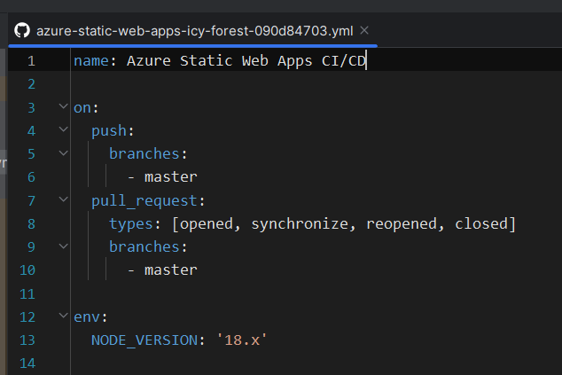
Regarding setting node version to 18: I added the following in the yml file:
env:
  NODE_VERSION: '18.x'
Print screen of node version setting: